20+
Reusable Components
Fast, flexible, and modern design system for your applications. This walkthrough moves from foundations to components to complete product screens.
Scroll to follow the parallax walkthrough
Your original design principles remain intact and now drive a clearer implementation layer across pages and Storybook.
The walkthrough uses subtle parallax offsets while preserving readability, so users can track where design rules become reusable UI patterns.
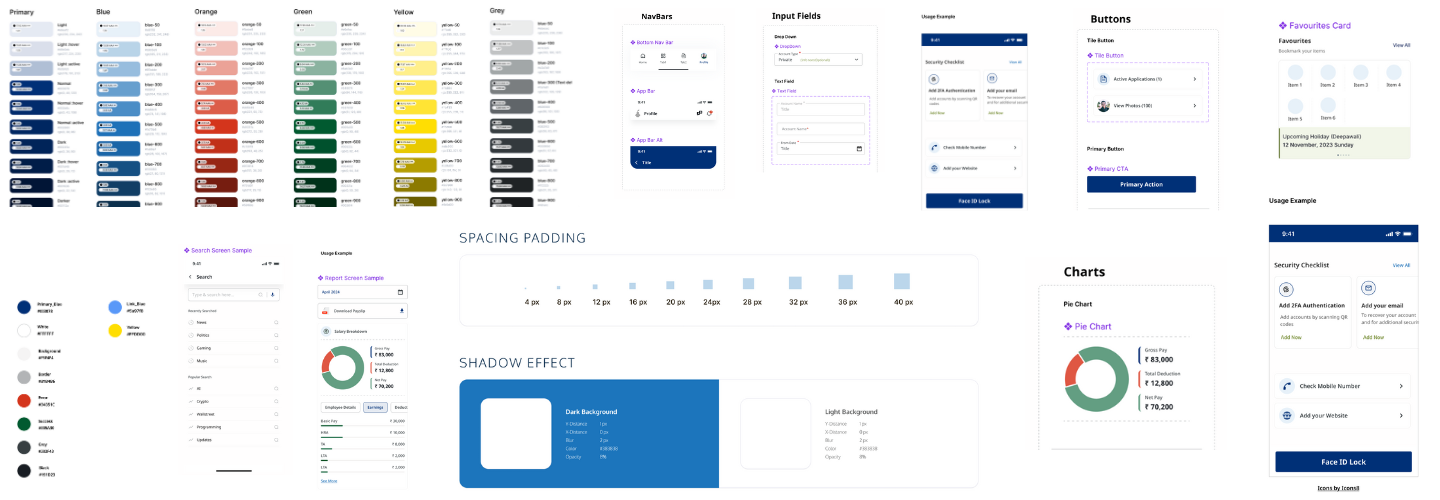
Start with color, type, spacing, and radius tokens to establish a stable visual language.
Compose interfaces with reusable primitives such as buttons, cards, inputs, and nav bars.
Ship pages with consistent behavior, strong hierarchy, and clear interaction states.

A flexible typography and grid system that adapts to any layout design.

Easily implement consistent color schemes and themes for a cohesive user experience.

A wide range of reusable and customizable components to streamline your development process.
Use docs for implementation, use components for execution, and use Storybook to validate behavior before product release.